Revamping NCB iziMobile’s Transfer Flow for Enhanced Usability and Competition

I - INTRODUCTION
NCB iziMobile, the banking app of National Citizen Bank, had become outdated with poor usability, legacy systems, and a cluttered interface—leading to increased drop-offs and user churn. A redesign was urgently needed to improve the user experience and meet modern digital expectations.
I joined the UX team at FPT Software to help redesign the money transfer flow for NCB iziMobile, a core feature making up 40% of app activity. My responsibilities included:
User Research & Insights
Reviewed over 1000 user feedback entries from NCB to identify key usability issues and define pain points related to lengthy flows, unclear UI, and missing trust indicators.
Design & Prototyping
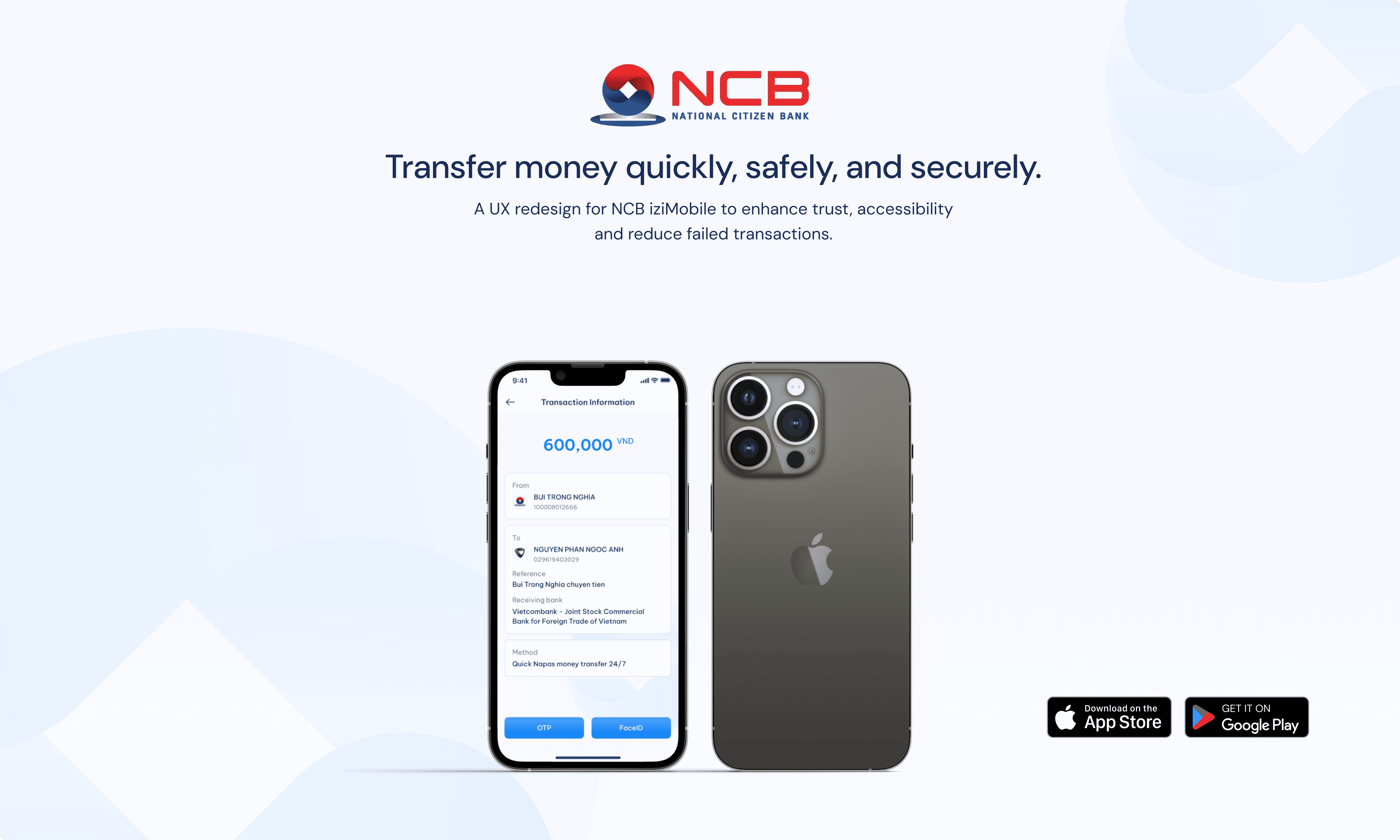
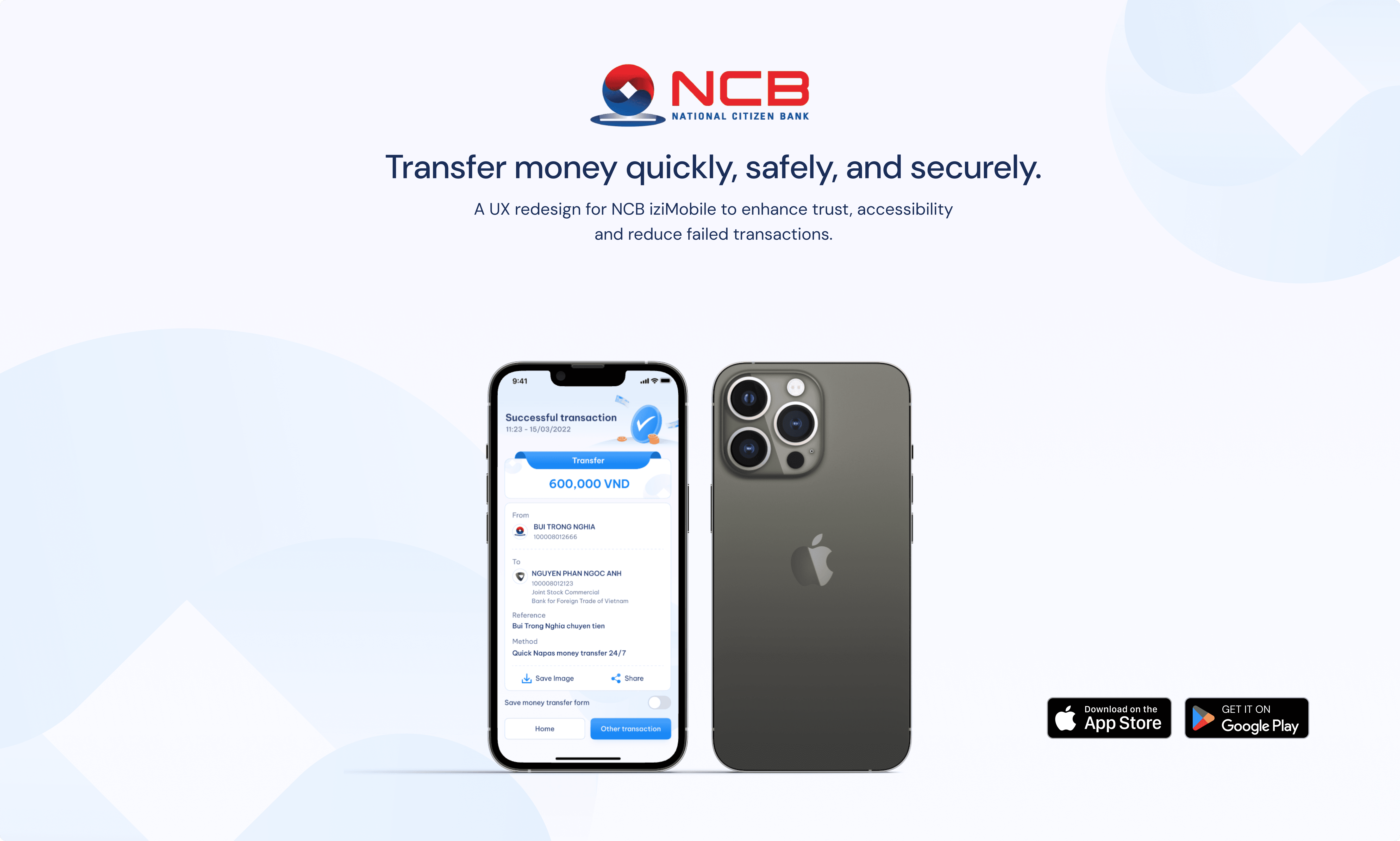
Created wireframes and interactive prototypes in Figma, simplifying the transfer flow from 5 steps to 3, increasing button size for accessibility, and adding security cues like OTP prompts and lock icons.
Usability Testing & Iteration
Supported 3 rounds of usability testing with over 10 users, iterating based on feedback to enhance clarity, speed, and accessibility, while collaborating with developers on performance testing to ensure smooth device performance.
Collaboration & Communication
Collaborated closely with UX/UI designers, product managers, and developers, joining weekly design reviews and client meetings to better understand business processes and constraints.
MY TEAM
I collaborated with a cross-functional team consisting of Product Manager, 3 UX Designers, 1 UI Designer, 3 Developers
We adopted the Double Diamond framework combined with a UX Strategy approach under the guidance of the Product Manager to ensure that every design decision was grounded in both user needs and business goals. Our process involved identifying pain points, iterating on solutions through testing, and collaborating with engineering for implementation.
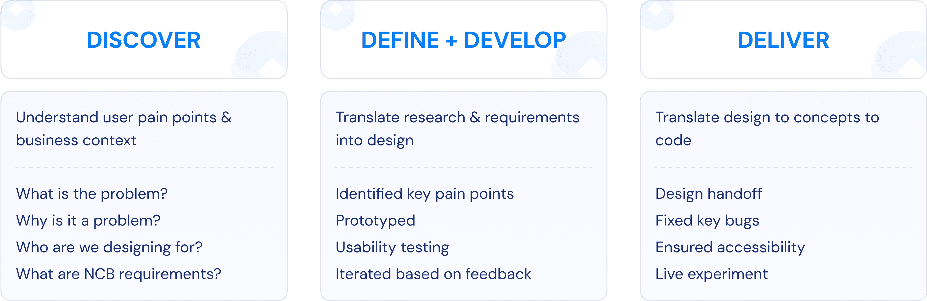
We adopted the Double Diamond framework combined with a UX Strategy approach under the guidance of the Product Manager to ensure that every design decision was grounded in both user needs and business goals.
Before diving into design concepts, we first needed to uncover key insights and gather essential information to guide our direction.

Before moving into user research or design, I partnered closely with NCB’s business and product teams to deeply understand the operational logic of the money transfer flow—used in 40% of all transactions. Through stakeholder workshops and documentation reviews, I gathered clear business goals, transfer types, and technical constraints to shape a practical and user-centered solution.

I analysed over 1000 pieces of feedback collected from NCB’s app reviews and user surveys to identify recurring issues in the money transfer flow. The key user pain points uncovered include:

To evaluate NCB iziMobile’s transfer flow, I assessed it against key usability and trust-building criteria. Despite offering a full-featured 5-step flow, the experience lacked recipient verification, clear navigation, and visual trust cues. Small buttons and poor layout overwhelmed users—especially older ones—leading to a high cancellation rate (25%) and increased churn. These gaps signalled the need for a simpler, more accessible flow aligned with modern UX standards.

The transfer screen was overly cluttered, lacking clear visual hierarchy and consistent layout, which made it difficult for users to navigate. Critically, there was no recipient name verification. These gaps undermined user confidence and increased abandonment, reinforcing the need for a more intuitive, guided, and trustworthy transfer experience.

To align our redesign with industry best practices, I conducted a competitor analysis of both local and global banking apps like TPBank, MoMo, and Monzo. By comparing flow length, button size, and trust cues, we identified key gaps in NCB’s experience—such as information overload and lack of verification. Insights from MoMo (simplicity) and HSBC (security) helped us balance speed with trust. This informed design decisions like reducing steps to 3, enlarging buttons, and adding verification cues—while also providing strong references for stakeholder alignment.

Through analysing NCB iziMobile and competitors like TPBank, MoMo, VietinBank, HSBC, and Barclays, I found that NCB’s current experience suffers from information overload, small buttons, lack of recipient verification, and unclear security messaging. In contrast, local leaders like TPBank and MoMo offer simplified flows, fast interactions, and strong trust cues. While global banks such as HSBC and Barclays excel in security and international features, their interfaces may be too complex or unfamiliar for older Vietnamese users. Based on these insights, I recommended that NCB reduce the flow to 3–4 steps, increase button size and add bank logos for easier navigation, implement clear security indicators, and include a back button to better support accessibility and reduce errors.
I categorised users into two main groups:

Through feedback analysis I uncovered two primary UX issues in NCB iziMobile’s 5-step transfer flow—leading to a 25% cancellation rate and preventing NCB from meeting goals like under 10% cancellations, 100% user trust, and 95% error-free transfers for elderly users (30% of the base).
All information was crammed onto one screen with small buttons, confusing layouts, and no logical input order. This overwhelmed users—72% reported feeling lost—and increased errors, especially among older users. The flow also forced users to enter the transfer amount before selecting a recipient, prioritising system logic over human logic. These frictions slowed tasks down (45s average) and led to a 25% cancellation rate.

Users felt anxious sending money without seeing the recipient’s name—68% said this caused hesitation. On top of that, the interface lacked basic trust cues like padlock icons or reassurance messages, making 65% of users feel unsafe—especially for high-value transfers. These gaps in trust eroded confidence and caused drop-offs.

Design goals helped me focus the redesign efforts on solving core user pain points while aligning with NCB’s strategic objectives—reducing transfer cancellations, building user confidence, and ensuring accessibility for all age groups.


I conducted two rounds of usability testing with 10 internal users (6 younger, 4 older) to evaluate the redesigned 3-step transfer flow and key features such as Smart OTP, QR code scanning, and transaction filters.
22% Faster Transfers
Average transaction time dropped from 45s → 35s, meeting NCB’s target and Minh’s speed expectations.
+100% User Trust
Created wireframes and interactive prototypes in Figma, simplifying the transfer flow from 5 steps to 3, increasing button size for accessibility, and adding security cues like OTP prompts and lock icons.
Improved Elderly Accessibility
100% of older users completed tasks error-free thanks to larger buttons, clearer layout.
Faster Transaction Search
All users found the “Savings Deposit” label easily after icon and colour enhancements, meeting business filter requirements.
This project was a hands-on opportunity to apply UX theory to a real-world banking product, helping me bridge the gap between user needs and business goals. I learned to align design decisions with NCB’s objectives—like reducing cancellations, increasing trust, and improving accessibility—through close collaboration with stakeholders and product teams. Analysing 1,200+ user reviews and running usability testing sharpened my research, data analysis, and synthesis skills.
I learned to design for a wide range of needs, from speed and security to accessibility, and saw firsthand how testing and iteration lead to better outcomes. Two usability rounds revealed key issues, which I quickly addressed through design updates.
Working alongside developers helped me understand technical constraints like API performance and device compatibility. I proposed practical solutions such as API caching and fallback flows, and became more confident in tools like Figma and team communication. I also gained practical knowledge of digital banking operations including Smart OTP, QR code transfers, and compliance.