Optimising the payment experience and revenue growth


I - INTRODUCTION
The problem was unclear—what caused user hesitation or which part of the payment flow needed fixing wasn’t known. This uncertainty made deep research essential to uncover real adoption barriers.
I led the complete redesign of the Driving Theory Test app’s payment flow, overseeing the project from research to launch within 3 months. My key contributions included:
Workshop Facilitation and User Research
Collaborated with Product Managers, Engineers, and Technicians in workshops to map workflows and identify pain points like unclear pricing. Synthesised user interviews into key personas to guide design decisions.
Design Execution
Turned insights into user flows, wireframes, and prototypes, improving navigation and reducing errors using the existing design system.
Communication with Stakeholders
Conducted fortnightly reviews with the Head of Product, Founder, Engineers, and QA, aligning user needs with technical limitations and addressing 90% of feedback.
Testing, Iteration & Handoff
Oversaw usability testing across iterations to improve usability. Managed handoff, resolving most developer questions for a smooth, bug-free launch.
User Experience Design, User Interface Design, User Research, Usability Testing, Prototyping, Bug Bashing, Design Handoff, Contribution to Design System
MY TEAM
I collaborated with a cross-functional team consisting of Head of Product Design, Business Development Lead, 1 Frontend Developer, 1 Backend Developer.
After 3 months of release, the user base grew from 768 to 1564, but user interviews with 10 participants and a customer journey map revealed friction in the payment flow, undermining trust. 70% found pricing unclear, 100% distrusted due to missing trial/refund details, 80% struggled with subscription management, and many noted UI delays. Post-payment, users lacked confirmation, causing uncertainty. These issues—unclear pricing, lack of transparency, limited control, UI delays, and post-payment confusion—led to a 20% Confusion Rate, prompting a redesign for a seamless payment experience.
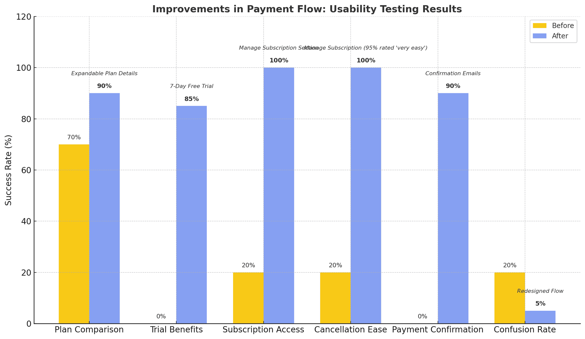
We collaborated with Product, Marketing, and Engineering to launch a 7-day free trial, Manage Subscription section, and expandable plan details, tackling unclear pricing, transparency, subscription control, and post-payment confusion. Usability testing with 10 users showed: 90% completed plan comparisons in 30 seconds (up from 50%), 85% understood trial benefits in 20 seconds, 100% accessed subscription details in 15 seconds and canceled in 1 minute (95% rated "very easy"), and 90% understood payment confirmations in 10 seconds. 80% upgraded without confusion, 12 UI issues were fixed, and Confusion Rate fell from 20% to 5%, boosting user confidence and engagement.
Our process involved identifying pain points, iterating on solutions through testing, and collaborating with engineering for implementation.
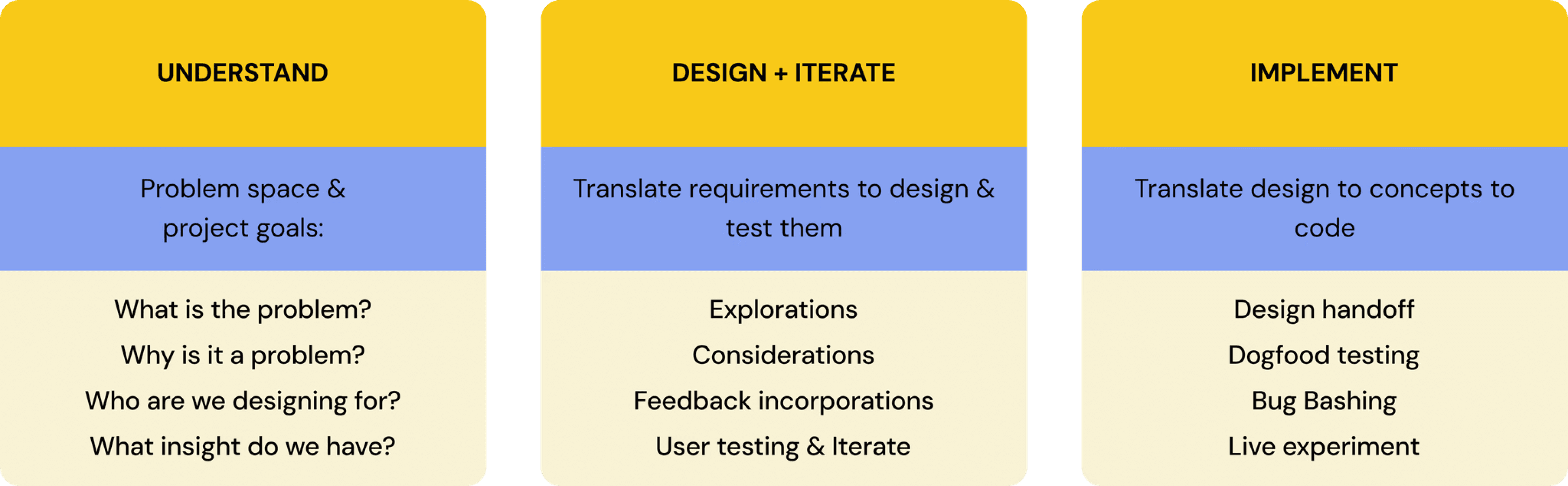
With initial guidance from the Head of Product, I approached the problem with a UX strategy mindset. I started by asking:

The purpose of this action was to gain a comprehensive understanding of the entire payment process, ensuring that each stage addressed user needs, supported business goals like increasing conversions, and aligned with our tech capabilities, such as Stripe integration, before moving into the design phase.
Before diving into design concepts, we first needed to uncover key insights and gather essential information to guide our direction.

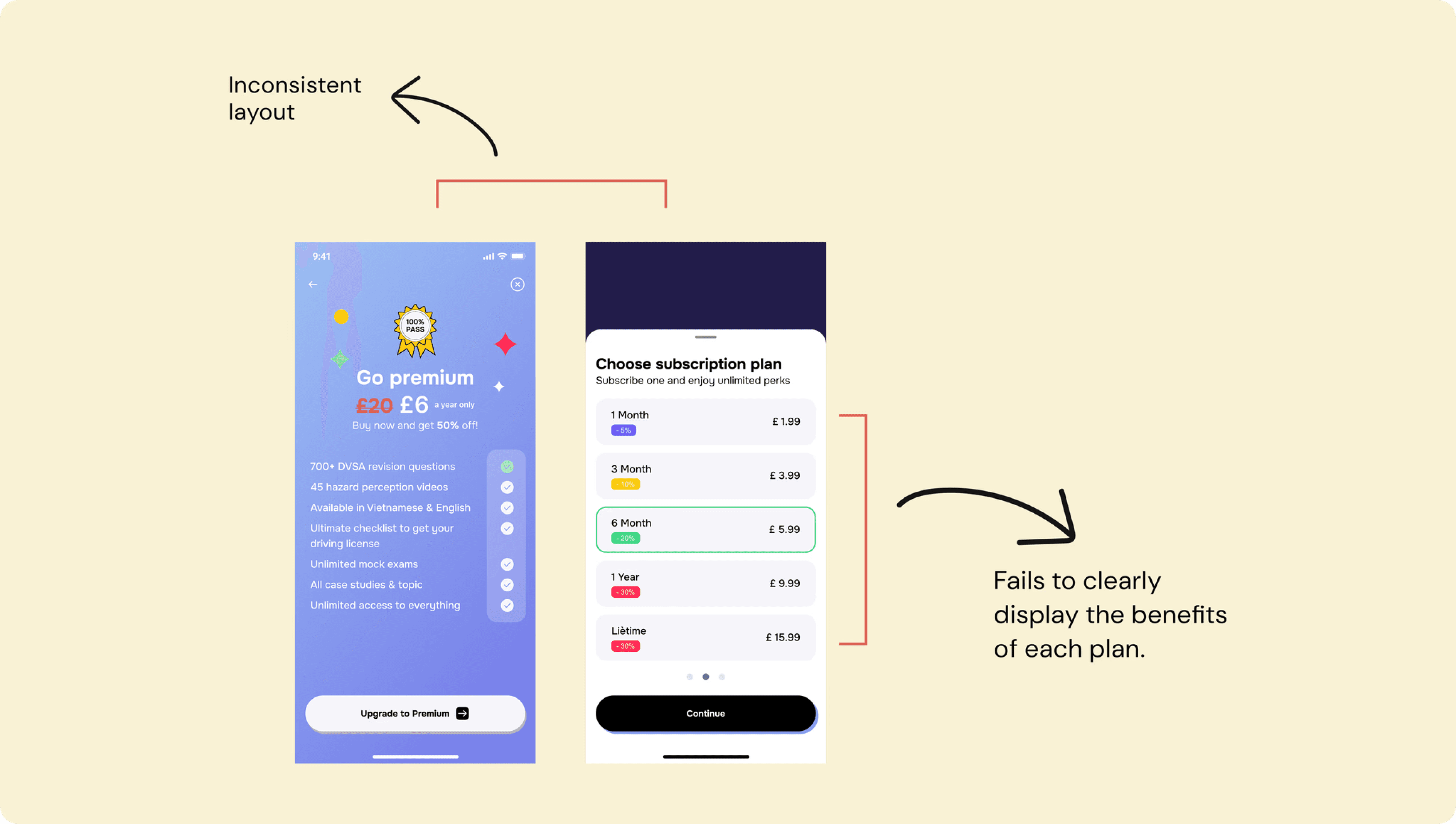
To evaluate the current payment flow, I assessed it against eight key criteria to ensure an effective, user-friendly, and conversion-focused experience. While the three-step process and flexible payment options worked well, several critical gaps were identified.

Package information is unclear, the screen layouts lack consistency, and there is no auto-fill for card details or email confirmation after payment. Most notably, there is no visible “Cancel” option and no “Manage Subscription” feature, which limits user control and trust. These missing elements highlighted the need for a more transparent and well-structured payment experience that empowers users and supports long-term engagement.
After reviewing the current flow, I analysed top competitors across driving theory, subscription, and edtech apps to identify best practices. This revealed key gaps in clarity, trust, and control, helping refine our positioning and improve the overall payment experience.

Competitor analysis showed that apps like Duolingo, Spotify, and YouTube perform well by using 2–3 step checkouts, clear pricing, visible trial terms, and integrated payment options like Apple Pay. In contrast, apps like Driving Theory Test 4-in-1 Kit and DVSA Kit lack clear “Manage Subscription” pages, hide the “Cancel” button, and don’t send email confirmations, leading to user confusion and complaints. These insights point to key opportunities for improvement in clarity, user control, and post-payment communication.
To design an optimal payment flow, I conducted interviews with 10 users to identify user groups, understand their desires and concerns before payment, and bridge the gap between desk and user research, aiming to solidify user issues and inform UX strategy-based solutions.
The interviews, divided into three phases, helped me understand user needs across segments, revealing that transparency and control are critical in UX design—particularly for Sceptical Users needing trust-building features like a trial. These insights informed the Customer Journey Map, enabling me to prioritise solutions (clearer pricing, 7-day trial, Manage Subscription feature) and secure stakeholder buy-in for the design phase with concrete user evidence.

“I’m not sure what I’m actually getting with each plan—it’s not clearly explained.” – James, 26, Manchester
“I wish there was a free trial so I could test it before paying.” – Linh, 23, Birmingham
“I had no idea what the refund policy was. That made me hesitate.” – Sarah, 30, London
“Apple Pay just feels faster and more secure—I always look for it first.” – Nam, 28, Leeds
“I didn’t get any confirmation—so I wasn’t sure if the payment went through.” – Hannah, 25, London
“I wanted to double-check what I paid for and how to cancel, but there was no clear info.” – Tom, 29, London
8 users (80%) mentioned frustration with subscription management, noting, “I couldn’t find an option to cancel my plan after signing up.” These insights directly informed the design decisions, highlighting the need for better subscription control.
By mapping the customer journey, I identified key friction points. Users struggled to locate the “Upgrade” button, encountered unclear pricing and hidden costs, and faced a lack of transparency around cancellation policies and security. Additionally, there was no noticeable difference before and after upgrading, making it difficult for users to perceive the value of each plan.

The purpose was to map out user interactions and emotions, ensuring the design addressed key friction points for all user segments. I learned that unclear pricing and lack of control at critical stages significantly impacted user trust and satisfaction, reinforcing the need for transparency and simplicity in the payment flow. This step guided the design strategy by prioritising solutions like simplified plan selection, a 7-day trial, and a Manage Subscription feature, enabling me to focus on high-impact areas and align with business goals in the Design + Iterate phase.
Through desk research, user interviews, and journey mapping, I identified critical pain points in the payment flow that directly informed the redesign solutions. Users hesitated due to unclear subscription value, hidden costs, and the absence of trial options. Additionally, difficulties in managing subscriptions, cancelling plans, and receiving confirmations fuelled frustration, highlighting areas ripe for targeted improvements.
The current design failed to convey the value of Premium plans, with two screens listing packages but lacking clear benefits. Upgrading offers key features—unlocking all question sets, unlimited practice modes, answer analysis, and advanced mock tests—yet users struggled to perceive this value, contributing to high drop-off rates. This insight drove the decision to implement separate, visually clear plan screens, linking directly to the solution’s focus on transparency and engagement.
Users lacked visibility into purchased plans, renewal dates, and cancellation options, causing post-purchase dissatisfaction. This deficiency, identified as a critical pain point, underscored the need for a dedicated management tool. The proposed “Manage Subscription” screen in the Profile tab was designed to address this, providing a foundation for the solution’s proactive usage dashboard and improved user control.

The lack of trial and refund policies was a major barrier, impacting user trust and conversion rates. These elements are vital for attracting new users, retaining existing ones, and enhancing market competitiveness. This gap necessitated a solution aligned with resource constraints, leading to the proposed 7-day free trial with personalised onboarding—pending Head of Product approval—to address market needs and business objectives effectively.

I defined two core design principles for Payment process

Current Challenge: The old design overwhelmed users by listing all plans (1 Month - £1.99, 3 Months - £3.99, 6 Months - £5.99, 1 Year - £9.99, Lifetime - £15.99) on one screen.
Redesign the layout to compare Freemium and Premium features on one screen, using colour-coded visuals to highlight benefits.
Pros: Clear premium benefits and vibrant visuals helped users compare free vs. paid plans and spot key offers like trials and discounts — 70% of users preferred this direct comparison for quicker decisions.
Cons: Missing direct links to terms and cancellation policies, while disconnected pricing and benefits made plan comparisons less intuitive.
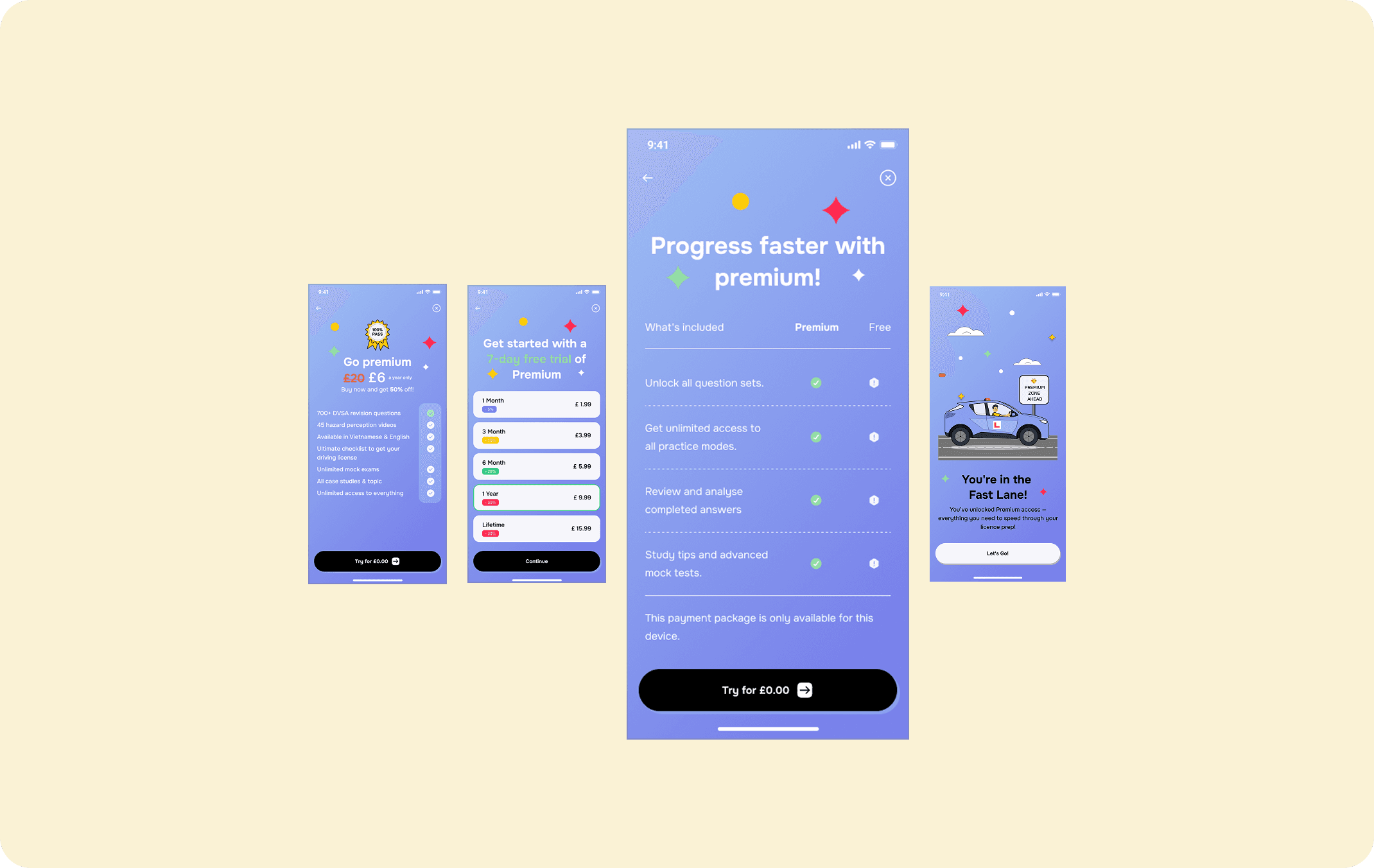
Display each plan on a dedicated screen with a consistent layout, showing pricing, benefits (e.g., “Unlock all question sets”), and policies (e.g., “Cancel anytime”). Add subtle visual cues like icons for key benefits.
Pros: Vibrant colours and whitespace improve readability and highlight key promotions, while clear Premium benefits, pricing, and terms simplify comparisons—80% of users found it easier to understand in testing. The consistent design also aligns with our existing UI system, reducing development effort.
Cons: Lacking a full view of all plans on one screen and separating pricing from benefits makes comparisons less intuitive — users can’t see all options at once, potentially increasing navigation time.
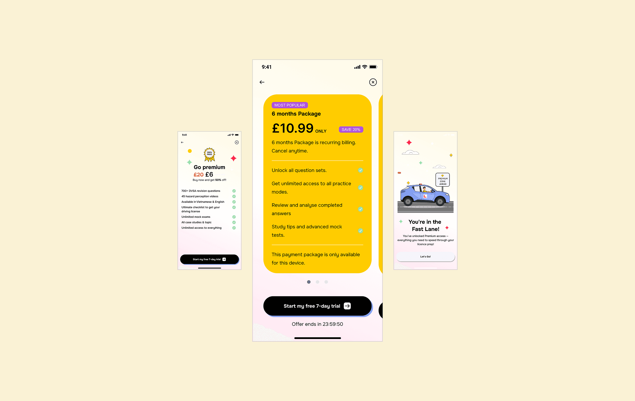
List all plans on one screen with expandable sections for details, emphasising discounts (e.g., “Save 20% with Lifetime”).
Pros: Easily comparing pricing, discounts, and Premium benefits supports intuitive decision-making, while highlighted offers and a 7-day trial encourage users to explore Premium.
Cons: Later screens emphasise pricing over features, making it harder to connect value with cost, while the final screen lacks clear payment instructions, leaving users unsure of the next steps.
Current Challenge: Post-purchase, 70% of users reported dissatisfaction due to the inability to manage subscriptions. Spotify’s subscription hub offers seamless control, a benchmark we aimed to meet within our constraints.
Add a subscription management section in the Settings tab to view renewals, switch plans, and cancel.
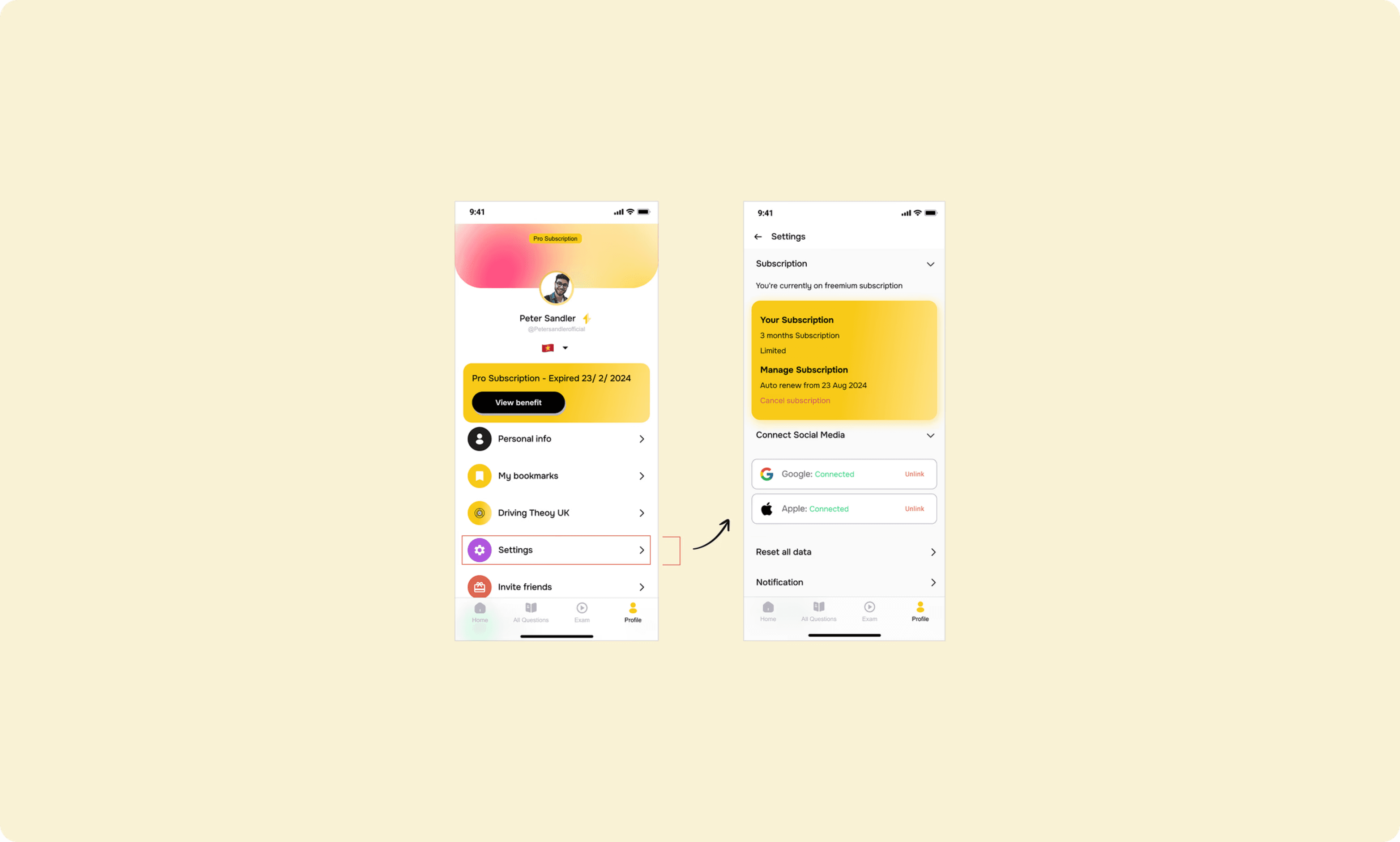
Pros: Clear subscription details are prominently displayed in settings, making it easy to track renewal dates and manage plans—this centralised location enhances convenience and user control.
Cons: Placing subscription management and account closure options too close may cause confusion or accidental actions, while overly concise subscription details can limit user understanding of their value.
Introduce a separate screen in the Profile tab, displaying current plan details, alternative plans, and a cancel option.

Pros: Users can access and manage their subscriptions directly from 'Manage Subscription', with perks and renewal dates clearly displayed to enhance awareness and control.
Cons: Users cannot easily compare different subscription tiers within the same screen.
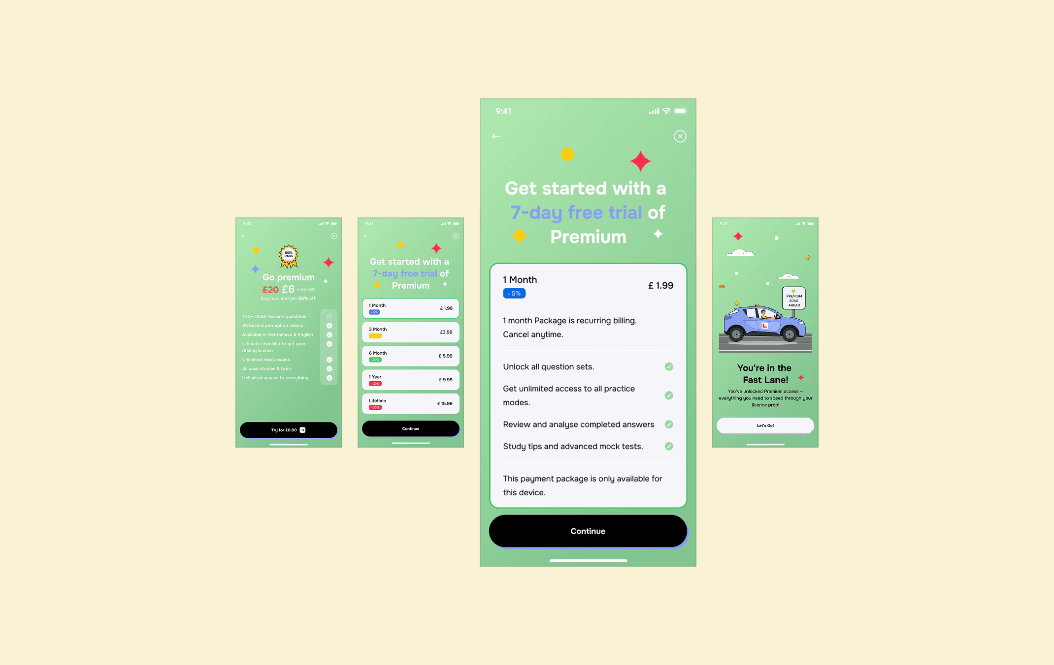
After extensive discussions and analysis, we chose Option 2 as the primary solution. This option effectively communicates the value of each subscription tier, helping users easily understand what they unlock with Premium. By separating plan details into dedicated screens, it reduces information overload and creates a structured flow for easier comparison of pricing, benefits, and policies. This option also ensures a consistent layout and visual hierarchy, improving readability, trust, and conversion rates by addressing user hesitation. Once approved, I refined and optimised the design while resolving minor issues for a seamless experience.

We chose Option 2—a Dedicated "Manage Subscription" Screen in Profile—as it offered the most intuitive navigation and aligned with user expectations for seamless in-app control. This approach ensures a centralised, easily accessible subscription hub, enhancing user autonomy while keeping the experience streamlined. Designed to fit within our existing development framework, it required only a new screen within the Profile tab, minimising implementation effort while maximising usability.

Following a detailed analysis with the Head of Product, a structured 7-day free trial was introduced to build trust and reduce hesitation. Users are required to enter their card details upfront, with the option to experience Premium features before committing. After the trial, the subscription automatically renews based on the plan initially selected. This approach not only meets user expectations for transparency and control but also supports business goals by encouraging smoother onboarding.
As for the refund policy, it was not implemented due to limited resources and operational capacity. This decision allows the team to focus on enhancing service quality and user experience instead of managing a complicated refund process.
To refine the payment experience, I conducted user testing with 10 participants across three predefined groups (Practical Learners, Busy Professionals, and Sceptical Users). Each completed identical tasks to validate the design’s effectiveness, assess transparency and trust improvements, align with user needs and business objectives, and gather feedback for further refinements. Testing spanned three iterations over two weeks.
Testing Process and Results

A/B Testing and Iterations
I conducted A/B testing with two UI versions: the original design and the improved version. The first iteration (Week 1) tested plan comparison and subscription management with 5 users, revealing a 20% confusion rate due to inconsistent button placement. Adjustments included standardising button sizes and colours, tested in Iteration 2 (Week 2) with 7 users, dropping confusion to 5%. Iteration 3 (Week 2) refined cancellation flow, achieving a 98% task success rate across 10 users. Each iteration used Nielsen’s usability heuristics, with feedback logged in a shared Figma file for transparency.
Identified Issues and Improvements
Major issues—unclear package value, missing subscription management, and complex cancellation—were resolved. Minor UI issues (e.g., inconsistent spacing, low-contrast text) were prioritised due to time constraints. Post-testing, Icollaborated with developers to fix 12 bugs (e.g., payment loader delays), verified in a final usability round, ensuring a 95% bug-free launch.


After conducting Usability Testing, major issues such as unclear package value communication, Manage Subscription, and Cancellation were resolved. Additionally, I identified minor UI issues, such as design consistency and information visibility.
From the identified issues, I continued making improvements. Given the limited time and resources, I prioritised addressing the most critical problems. I then conducted A/B Testing with two UI versions—before and after improvements—followed by three iterations of usability testing to refine the enhancements. After this process, we finalised the design.
I conducted usability testing to validate the new design’s effectiveness, using tasks like plan selection and subscription management to assess usability and trust, revealing that 20% of users struggled with the “Cancel Subscription” button’s small size and placement, and small fonts hindered pricing readability. The purpose was to ensure solutions like Separate Plan Details, Manage Subscription, and the 7-day trial reduced friction and met business goals (higher conversion, fewer drop-offs) across diverse user groups. I learned that small UI details (button size, font, spacing) greatly impact user experience, especially for Busy Professionals with limited time, and iterations highlighted the value of continuous testing. This step provided data to finalise the design for handoff (confusion rate dropped from 20% to 5%), building confidence for the Implement phase and preparing me for Beta Testing by addressing UI issues early.
Unforeseen challenges are inevitable in any project. It's important to adapt and find the best ways to address these issues as they arise. During the redesign process, we encountered key blockers that required careful consideration:
Conduct Thorough Beta Testing
Review the prototype on the Play Store/App Store to identify usability issues, performance glitches, and user pain points, while ensuring the app meets functional requirements and user expectations through systematic testing.
Identify and Document Bugs
Log identified issues with detailed descriptions, screenshots, and reproduction steps, and prioritise them based on severity and impact on user experience.
Collaborate with Development Teams
Communicate identified bugs and improvement suggestions to developers for prompt resolution, and actively participate in discussions to clarify issues and verify fixes after implementation.
Navigating Implementation Challenges
Every project encounters unforeseen challenges, requiring adaptability to ensure successful outcomes. During the redesign of the payment flow, we faced several constraints that necessitated strategic adjustments to meet user needs, business objectives, and technical requirements.
Technical Limitations
Cross-Team Collaboration
Achieving alignment between user needs, business objectives, and development capabilities required continuous teamwork. This process involved managing competing priorities and making strategic trade-offs. Through weekly discussions with the Head of Product and engineering team, we explored alternative solutions. These preserved core functionality while enhancing user experience. Despite resource constraints, the final design improved clarity, control, and ease of use in the payment flow. This led to 185% user growth (from 245 to 768 users, post-launch data), driven by targeted marketing campaigns, the 7-day trial, and the optimised payment experience.
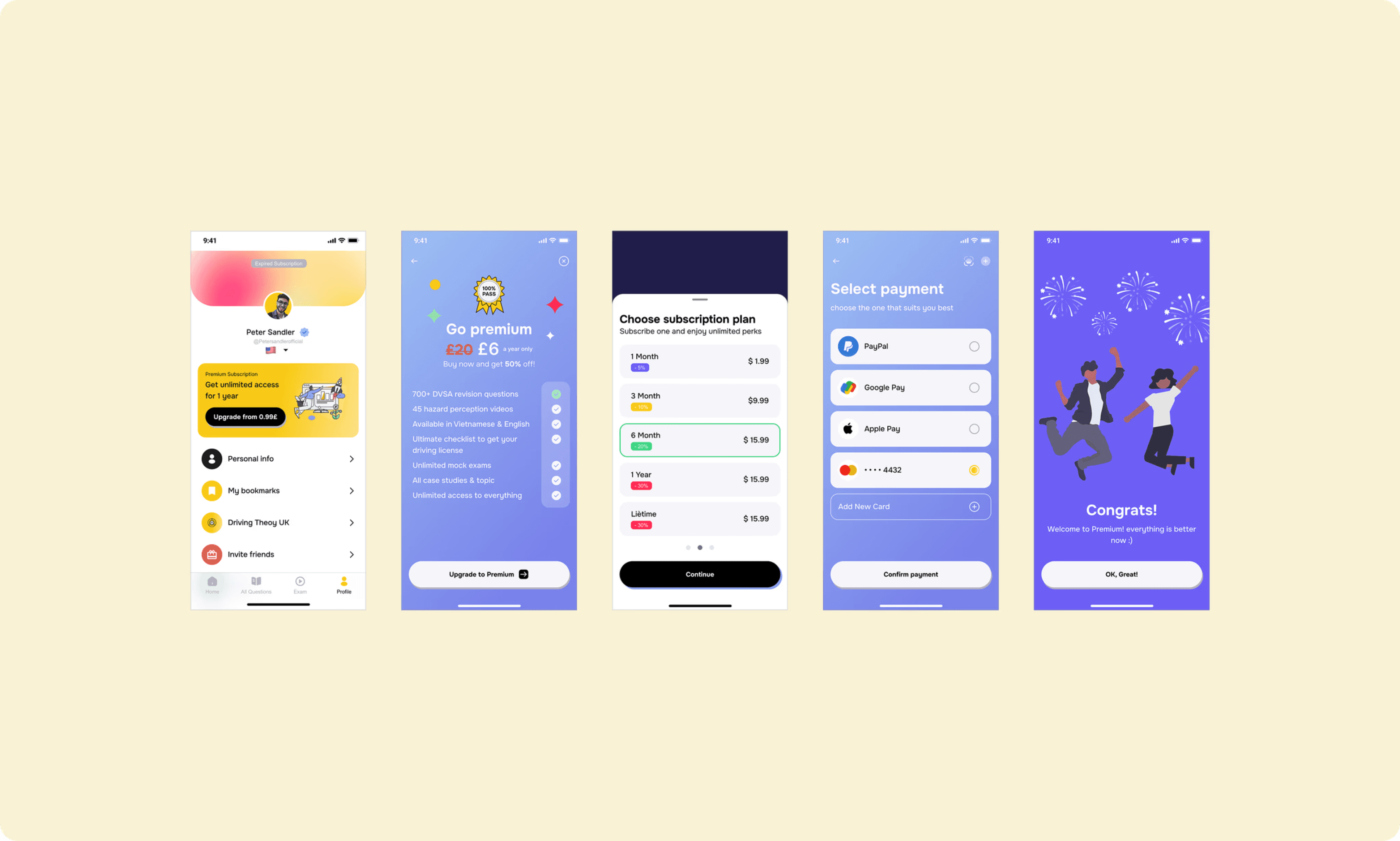
Choose plan & Payment - Final design solution
Manage & Cancel Subscription - Final design solution


